We go to sea to measure biological rates to get a sense of what is relevant. We develop laboratory experiments to discover the environmental controls on the bacteria performing these rates. But how to connect everything together into an overall picture of how Earth’s climate is shaped by these microorganisms? Modeling is of course the answer!
By creating simple models, we are able to elucidate how a process we see in the environment affects climate, scaling up from the microbial world to the whole of the the planet. As a fascinating vignette, we have shown how overlooked migrating zooplankton can change nitrogen biogeochemistry.
Another exciting avenue of research utilizes vast amounts of data collected over decades in the ocean and atmosphere. Why collect more data if there are already gazillions searchable on Google? Plus, the advantage is that in a time of pandemic (who knew we’d have to prep for those?), the data still exist! Check out one recent study that’s seeded a new research direction in the group on nitrous oxide measurements in Samoa, and using back trajectory modeling to identify ocean hotspots of N2O production!
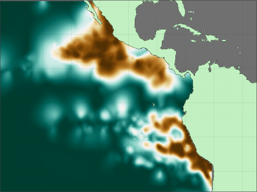
We’ve utilized similar large datasets by scraping a literal ton – over 15 million measurements – collected across decades on ships and by autonomous robots to map the oxygen deficient zones in the ocean. We took a slightly different tack than previous researchers because we didn’t rely on the absolute oxygen concentrations measured but rather the gradient of oxygen with depth. This switch in thinking permitted us to isolate the layers where the gradient collapses to zero, indicative that the concentrations reached the lowest values they can achieve in these non-sulfidic zones.